Farrow & Ball’s shade known as Yonder is capturing the attention of designers and homeowners alike, emerging as a sought-after color in contemporary interior design. This vibrant yet soothing paint has gained traction for its unique ability to blend warmth with brightness, making it a versatile option for various spaces. Designers are now evaluating whether its popularity will endure beyond current trends.
The Allure of Yonder
Characterized as a fresh and cozy hue, Yonder stands out among blue paints for its inviting warmth. According to Patrick O’Donnell, brand ambassador at Farrow & Ball, this color is reminiscent of “morning coastal skies of the northern hemisphere.” He notes that it strikes a balance by including a hint of black to prevent it from appearing overly sharp.
The shade has proven to be particularly captivating in south-facing rooms, where it flourishes in natural light, creating an atmosphere that is both optimistic and cheerful. Its adaptability makes it suitable for a variety of settings, from living rooms to children’s bedrooms. O’Donnell suggests its application in guest rooms or sunny kitchens, where it can enhance the overall ambiance.
Design Applications of Yonder
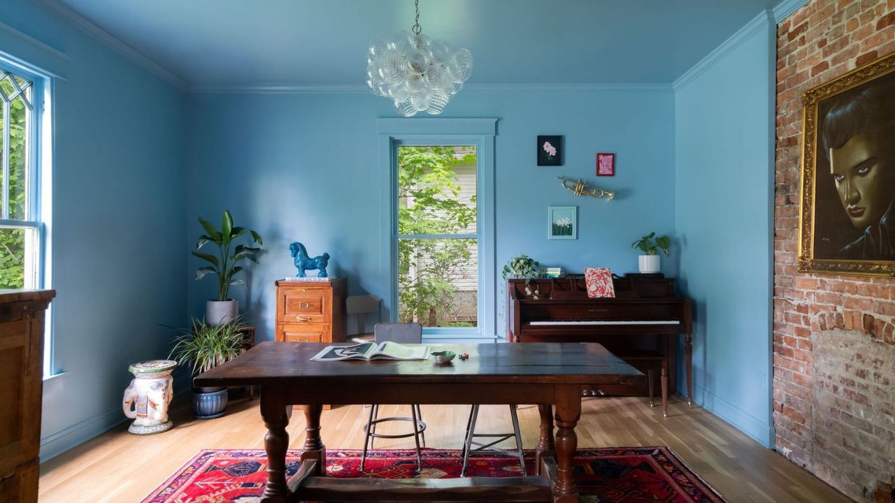
Interior designers are finding innovative ways to incorporate Yonder into their projects. For example, Kristin Bock of Bock Building Co. used it to create a striking parlor in Nashville. Bock describes her choice of Yonder as a fun complement to her décor, specifically a vintage piece she refers to as “Velvet Elvis.” She emphasizes the color’s balance, stating it does not lean too cool or warm, making it a joyful presence in the room.
In another notable application, Lucy Williams of Lucy Williams Home embraced the boldness of Yonder for a living space, creating a snug and inviting atmosphere. By pairing it with warm wood tones and rich furnishings, she demonstrates the color’s ability to enhance comfort while retaining a vibrant aesthetic. Bock adds that Yonder maintains its appeal throughout the day, adapting beautifully from bright daylight to the soft glow of candlelight.
For children’s spaces, Sarah Southwell of Sarah Southwell Design highlights Yonder’s bright and uplifting qualities. She describes how it energizes a room, making it an ideal choice for a child’s nook, bringing warmth and cheerfulness that is instantly welcoming.
Accent and Cohesion with Yonder
Beyond full room applications, Yonder also shines as an accent color. Southwell’s designs showcase its use in woodwork, where it pairs effectively with neutral tones for a balanced look. O’Donnell advises that when using Yonder as an accent, it is crucial to choose complementary colors. For a clean aesthetic, pairing it with a pure white like All White is recommended. Alternatively, integrating deeper shades like brown or bolder blues can add depth and interest.
As designers continue to explore the potential of Yonder, its current popularity suggests it may become a lasting staple in interior design. The color’s personality-driven applications—focused on comfort and livability rather than fleeting trends—point towards its enduring appeal.
With its ability to transform spaces from cozy retreats to vibrant living areas, Yonder is more than just a passing trend; it is a color that invites creativity and warmth into homes. As homeowners and designers alike embrace this shade, it is clear that Yonder is not just in vogue, but a genuine contender for timelessness in interior design.